这是一个关于如何使用Phyloseq将扩增子微生物组数据导入R并运行一些基本分析以了解样本中微生物群落多样性和组成的演示。该软件包的更多演示可从作者处获取。此脚本是使用Rmarkdown创建的。
作者:Michelle Berry
更新日期:2016年4月14日
===================================================================
在本教程中,我们使用的是已经通过mothur流程处理成OTU和分类表的illumina 16s数据。如果您的原始序列数据是通过不同的流程处理的,Phyloseq有多种导入选项。
这些样本是在2014年5月至11月期间从伊利湖西部盆地的三个不同地点收集的。该数据集的目标是了解伊利湖中的细菌群落如何在主要由蓝藻属Microcystis引起的有毒藻类水华期间发生变化。
在本教程中,我们将学习如何使用Phyloseq软件包将OTU表和样本元数据导入R。我们将进行一些基本的探索性分析,检查样本的分类组成,并使用排序方法在低维空间中可视化样本之间的差异性。最后,我们将估计样本的α多样性(丰富度和均匀度)。
库
#Load libraries
library(ggplot2)
library(vegan)
library(dplyr)
library(scales)
library(grid)
library(reshape2)
library(phyloseq)

# Set working directory
setwd("~/chabs/miseq_may2015/analysis/")

# Source code files
# miseqR.R can be found in this repository
source("~/git_repos/MicrobeMiseq/R/miseqR.R")

# Set plotting theme
theme_set(theme_bw())
数据导入
首先,我们将导入mothur共享文件、共识分类文件以及我们的样本元数据,并将它们存储在一个phyloseq对象中。通过将所有数据结构存储在一个对象中,我们可以轻松地在各个结构之间进行交互。例如,正如我们稍后会看到的,我们可以使用样本元数据中的标准从OTU表中选择某些样本。
# Assign variables for imported data
sharedfile = "mothur/chabs.shared"
taxfile = "mothur/chabs-silva.taxonomy"
mapfile = "other/habs_metadata_cleaned.csv"

# Import mothur data
mothur_data <- import_mothur(mothur_shared_file = sharedfile,
  mothur_constaxonomy_file = taxfile)

# Import sample metadata
map <- read.csv(mapfile)
样本元数据只是一个包含样本属性列的基本csv文件。以下是一个样本元数据的预览。正如您所看到的,有一个名为SampleID的列,其中包含每个样本的名称。其余列包含与每个样本相关的环境或采样条件的信息。
head(map)## SampleID Date Station Shore Fraction Type Samplenum Date_year
## 1 E0010_CNA 6/16 nearshore2 nearshore CNA sample E0010 6/16/14
## 2 E0012_CNA 6/16 nearshore1 nearshore CNA sample E0012 6/16/14
## 3 E0014_CNA 6/16 offshore offshore CNA sample E0014 6/16/14
## 4 E0016_CNA 6/30 nearshore2 nearshore CNA sample E0016 6/30/14
## 5 E0018_CNA 6/30 nearshore1 nearshore CNA sample E0018 6/30/14
## 6 E0020_CNA 6/30 offshore offshore CNA sample E0020 6/30/14
## Month Days pH SpCond StationDepth Secchi Temp Turbidity ParMC DissMC
## 1 June 20 8.080 290.6 5.1 0.9 22.4 10.10 0 NA
## 2 June 20 8.390 300.4 6.1 0.9 23.3 11.90 0 NA
## 3 June 20 8.308 281.7 8.5 4.0 22.5 1.34 0 NA
## 4 June 34 8.647 291.5 4.9 1.3 24.7 4.81 0 NA
## 5 June 34 8.435 290.0 6.0 1.4 24.5 4.01 0 NA
## 6 June 34 8.609 311.8 8.0 2.0 24.8 1.79 0 NA
## Phycocyanin Chla DOC SRP TP TDP POC PON PP N.P Nitrate
## 1 0.31 10.72 3.26025 4.16 36.1 12.3 0.68 0.15 23.84 6.15 482.5
## 2 1.06 34.37 3.40300 1.11 56.8 10.5 1.72 0.32 46.22 6.89 545.0
## 3 0.44 12.26 3.24075 0.24 19.7 4.4 0.84 0.13 15.31 8.31 475.0
## 4 1.69 19.94 3.84425 0.65 26.3 6.7 0.96 0.15 19.69 7.63 472.0
## 5 0.63 7.88 3.02160 0.17 19.4 4.6 0.59 0.12 14.83 7.92 444.5
## 6 1.59 12.93 3.38725 0.27 23.7 5.7 0.78 0.13 18.05 7.24 611.5
## Ammonia H2O2 CDOM
## 1 3.51 217.1213 4.212388
## 2 2.14 180.3269 4.252438
## 3 10.41 224.5438 3.523810
## 4 8.64 190.3620 3.454660
## 5 16.18 167.6386 4.595779
## 6 20.65 199.2388 6.792312
我们通过一个简单的构造函数将这个数据框转换为phyloseq格式。将样本数据合并到phyloseq对象中所需的唯一格式要求是,行名必须与您共享文件和分类文件中的样本名称相匹配。
map <- sample_data(map)

# Assign rownames to be Sample ID's
rownames(map) <- map$SampleID
我们需要将元数据合并到我们的phyloseq对象中。
# Merge mothurdata object with sample metadata
moth_merge <- merge_phyloseq(mothur_data, map)
moth_merge

## phyloseq-class experiment-level object
## otu_table()   OTU Table:         [ 19656 taxa and 56 samples ]
## sample_data() Sample Data:       [ 56 samples by 32 sample variables ]
## tax_table()   Taxonomy Table:    [ 19656 taxa by 6 taxonomic ranks ]

现在我们有一个名为moth.merge的phyloseq对象。如果需要,我们也可以将系统发育树或包含OTU代表性序列的fasta文件添加到这个对象中。在任何时候,我们都可以打印出phyloseq对象中存储的数据结构,以便快速查看其内容。

在继续进行分析之前,我们需要进行一些基本的重新格式化和过滤。

我们的分类文件的列名是什么?
colnames(tax_table(moth_merge))
## [1] "Rank1" "Rank2" "Rank3" "Rank4" "Rank5" "Rank6"
这些分类名称没有帮助,所以让我们重命名它们
colnames(tax_table(moth_merge)) <- c("Kingdom", "Phylum", "Class",
"Order", "Family", "Genus")
现在,让我们过滤掉我们不想包含在分析中的样本,例如提取和 PCR 空白(我们可以稍后查看这些样本,看看那里有什么)
注意:我的元数据中有一个名为“Type”的列prune_taxa命令中出现的“.”用于引用我们正在管道中的数据对象(删除了非样本的 phyloseq 对象)
moth_sub <- moth_merge %>%
subset_samples(Type == "sample") %>%
prune_taxa(taxa_sums(.) > 0, .)
现在我们将过滤掉真核生物、古细菌、叶绿体和线粒体,因为我们只是为了扩增细菌序列。您可能已经在 mothur 中完成了此过滤,但最好检查分类表中没有任何潜伏内容。我喜欢在运行 mothur 时将这些生物保留在我的数据集中,因为它们很容易使用 Phyloseq 删除,有时我有兴趣探索它们。erie <- moth_sub %>%
subset_taxa(
Kingdom == "Bacteria" &
Family != "mitochondria" &
Class != "Chloroplast"
)
erie
## phyloseq-class experiment-level object
## otu_table() OTU Table: [ 7522 taxa and 56 samples ]
## sample_data() Sample Data: [ 56 samples by 32 sample variables ]
## tax_table() Taxonomy Table: [ 7522 taxa by 6 taxonomic ranks ]示例摘要
作为第一个分析,我们将查看样本中读取计数的分布
# Make a data frame with a column for the read counts of each sample
sample_sum_df <- data.frame(sum = sample_sums(erie))

# Histogram of sample read counts
ggplot(sample_sum_df, aes(x = sum)) +
  geom_histogram(color = "black", fill = "indianred", binwidth = 2500) +
  ggtitle("Distribution of sample sequencing depth") +
  xlab("Read counts") +
  theme(axis.title.y = element_blank())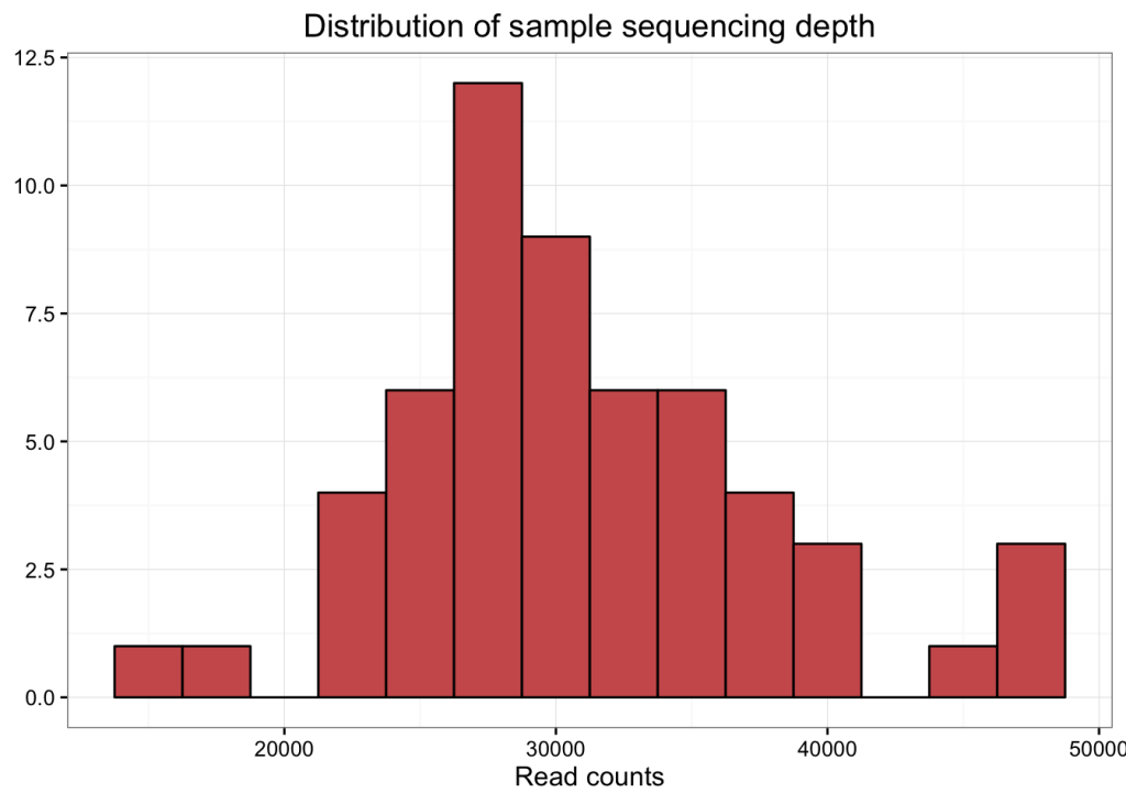
# mean, max and min of sample read counts
smin <- min(sample_sums(erie))
smean <- mean(sample_sums(erie))
smax <- max(sample_sums(erie))
堆叠条形图
让我们制作一个 Phyla 的堆叠条形图,以了解这些样本中的群落构成。
由于这不是定量分析,并且由于我们在这个数据集中的门多于我们合理区分颜色的能力(43!),我们将修剪掉低丰度的类群,只包括贡献超过每个样本相对丰度 2% 的门。根据您的数据集和您所描述的分类级别,您可以调整此修剪参数。在以后的分析中,我们当然会包括这些类群,但现在它们只会弄乱我们的图。
# melt to long format (for ggploting)
# prune out phyla below 2% in each sample

erie_phylum <- erie %>%
  tax_glom(taxrank = "Phylum") %>%                     # agglomerate at phylum level
  transform_sample_counts(function(x) {x/sum(x)} ) %>% # Transform to rel. abundance
  psmelt() %>%                                         # Melt to long format
  filter(Abundance > 0.02) %>%                         # Filter out low abundance taxa
  arrange(Phylum)                                      # Sort data frame alphabetically by phylum
# Set colors for plotting
phylum_colors <- c(
"#CBD588", "#5F7FC7", "orange","#DA5724", "#508578", "#CD9BCD",
"#AD6F3B", "#673770","#D14285", "#652926", "#C84248",
"#8569D5", "#5E738F","#D1A33D", "#8A7C64", "#599861"
)
# Plot
ggplot(erie_phylum, aes(x = Date, y = Abundance, fill = Phylum)) +
facet_grid(Station~.) +
geom_bar(stat = "identity") +
scale_fill_manual(values = phylum_colors) +
scale_x_discrete(
breaks = c("7/8", "8/4", "9/2", "10/6"),
labels = c("Jul", "Aug", "Sep", "Oct"),
drop = FALSE
) +
# Remove x axis title
theme(axis.title.x = element_blank()) +
#
guides(fill = guide_legend(reverse = TRUE, keywidth = 1, keyheight = 1)) +
ylab("Relative Abundance (Phyla > 2%) \n") +
ggtitle("Phylum Composition of Lake Erie \n Bacterial Communities by Sampling Site") 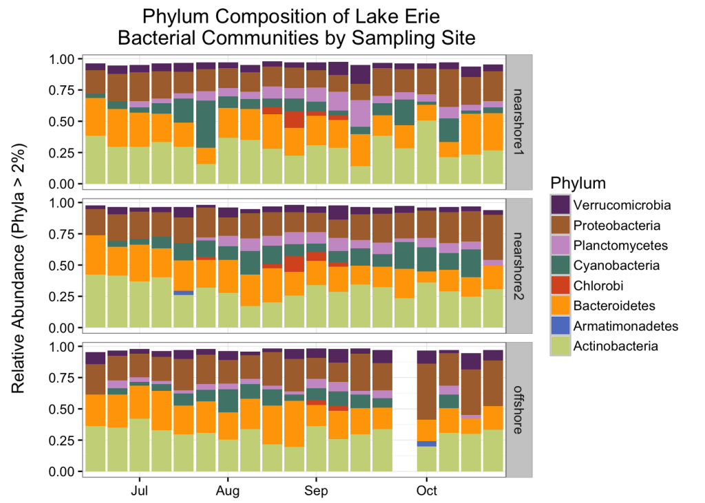
该图是使用刻面创建的,以通过采样站沿 y 轴分离样品。这是 ggplot 的一大特色。
请注意,每个样本的总和并不完全等于 1。这反映了被移除的稀有门。如果您希望您的绘图看起来像所有东西加起来,您可以将 position = “fill” 添加到 geom_bar() 命令中。
不受约束的排序
扩增子数据的最佳探索性分析之一是无约束顺序。在这里,我们将查看我们整个社区样本的按立。我们将使用 miseqR.R 中的 scale_reads() 函数来缩放到最小的库大小,这是默认的。如果要缩放到另一个深度,可以通过设置“n”参数来实现。
# Scale reads to even depth
erie_scale <- erie %>%
  scale_reads(round = "round")

# Fix month levels in sample_data
sample_data(erie_scale)$Month <- factor(
  sample_data(erie_scale)$Month,
  levels = c("June", "July", "August", "September", "October")
)


# Ordinate
erie_pcoa <- ordinate(
  physeq = erie_scale,
  method = "PCoA",
  distance = "bray"
)

# Plot
plot_ordination(
  physeq = erie_scale,
  ordination = erie_pcoa,
  color = "Month",
  shape = "Station",
  title = "PCoA of Lake Erie bacterial Communities"
) +
  scale_color_manual(values = c("#a65628", "red", "#ffae19",
    "#4daf4a", "#1919ff", "darkorchid3", "magenta")
  ) +
  geom_point(aes(color = Month), alpha = 0.7, size = 4) +
geom_point(colour = "grey90", size = 1.5) 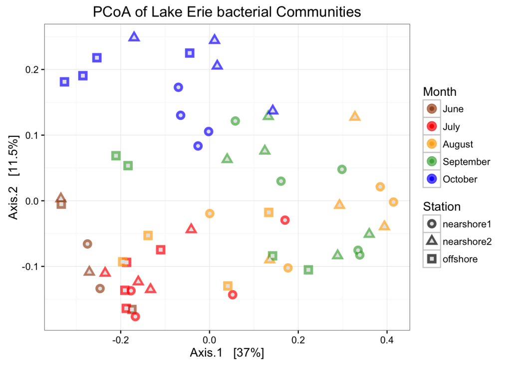
让我们尝试一下 NMDS。对于 NMDS 图,设置种子很重要,因为样本在 alogrithm 中的起始位置是随机的。
重要提示:如果您“内联”计算您的 bray-curtis 距离指标,它将执行平方根变换和威斯康星州双标准化。如果您不想要这个,您可以单独计算您的 bray-curtis 距离
set.seed(1)

# Ordinate
erie_nmds <- ordinate(
  physeq = erie_scale,
  method = "NMDS",
  distance = "bray"
)
## Square root transformation
## Wisconsin double standardization
## Run 0 stress 0.1579025
## Run 1 stress 0.1819437
## Run 2 stress 0.240828
## Run 3 stress 0.1866267
## Run 4 stress 0.185961
## Run 5 stress 0.2000213
## Run 6 stress 0.1710585
## Run 7 stress 0.1711768
## Run 8 stress 0.2248862
## Run 9 stress 0.1580173
## ... procrustes: rmse 0.005865558 max resid 0.02795903
## Run 10 stress 0.1579805
## ... procrustes: rmse 0.00415466 max resid 0.02854737
## Run 11 stress 0.210445
## Run 12 stress 0.1579419
## ... procrustes: rmse 0.002487412 max resid 0.01392694
## Run 13 stress 0.1579215
## ... procrustes: rmse 0.004302403 max resid 0.02680986
## Run 14 stress 0.2153886
## Run 15 stress 0.2408162
## Run 16 stress 0.2032362
## Run 17 stress 0.1710288
## Run 18 stress 0.214908
## Run 19 stress 0.1819041
## Run 20 stress 0.1711611# Plot
plot_ordination(
physeq = erie_scale,
ordination = erie_nmds,
color = "Month",
shape = "Station",
title = "NMDS of Lake Erie bacterial Communities"
) +
scale_color_manual(values = c("#a65628", "red", "#ffae19",
"#4daf4a", "#1919ff", "darkorchid3", "magenta")
) +
geom_point(aes(color = Month), alpha = 0.7, size = 4) +
geom_point(colour = "grey90", size = 1.5) 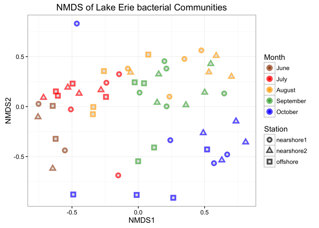
NMDS 图试图在二维上尽可能准确地显示样本之间的序数距离。报告这些图的应力很重要,因为高应力值意味着算法很难在 2 维上表示样本之间的距离。该图的应力还可以 – 它是 .148(通常任何低于 .2 的值都被认为是可以接受的)。然而,该数据的 PCoA 能够在两个维度上显示很多变化,并且它更好地显示了该数据集中的时间趋势,因此我们将坚持使用该图。
PERMANOVA
以下是如何在素食主义者中使用 adonis 函数运行 permanova 测试的示例。在这个例子中,我们正在检验以下假设:我们从中收集样本的三个站点具有不同的质心
set.seed(1)

# Calculate bray curtis distance matrix
erie_bray <- phyloseq::distance(erie_scale, method = "bray")

# make a data frame from the sample_data
sampledf <- data.frame(sample_data(erie))

# Adonis test
adonis(erie_bray ~ Station, data = sampledf)
##
## Call:
## adonis(formula = erie_bray ~ Station, data = sampledf)
##
## Permutation: free
## Number of permutations: 999
##
## Terms added sequentially (first to last)
##
##           Df SumsOfSqs MeanSqs F.Model      R2 Pr(>F)
## Station    2    0.6754 0.33772  2.7916 0.09531  0.003 **
## Residuals 53    6.4118 0.12098         0.90469
## Total     55    7.0872                 1.00000
## ---
## Signif. codes:  0 '***' 0.001 '**' 0.01 '*' 0.05 '.' 0.1 ' ' 1
# Homogeneity of dispersion test
beta <- betadisper(erie_bray, sampledf$Station)
permutest(beta)##
## Permutation test for homogeneity of multivariate dispersions
## Permutation: free
## Number of permutations: 999
##
## Response: Distances
## Df Sum Sq Mean Sq F N.Perm Pr(>F)
## Groups 2 0.025388 0.012694 2.3781 999 0.114
## Residuals 53 0.282915 0.005338该输出告诉我们,我们的 adonis 检验很重要,因此我们可以拒绝我们的三个站点具有相同质心的原假设。
此外,我们的 betadisper 结果并不显着,这意味着我们不能拒绝我们的组具有相同离散度的原假设。这意味着我们可以更有信心我们的 adonis 结果是真实的结果,而不是由于群体离散度的差异
这里可以做更多的分析。我们可以使用 Bray-curtis 以外的距离指标,我们可以测试不同的分组变量,或者我们可以通过测试组合多个变量的模型来创建更复杂的 permanova。不幸的是,目前还没有针对 adonis 开发的事后测试。
受约束的排序
上面我们使用无约束顺序(PCoA、NMDS)来显示低维样本之间的关系。我们可以使用约束顺序来了解环境变量如何与群落构成的这些变化相关联。我们将顺序轴限制为环境变量的线性组合。然后,我们将环境分数绘制到任命上
# Remove data points with missing metadata
# 删除缺少元数据的数据点

erie_not_na <- erie_scale %>%
  subset_samples(
    !is.na(Phycocyanin) &
      !is.na(SRP) &
      !is.na(pH) &
      !is.na(ParMC) &
      !is.na(H2O2)
  )

bray_not_na <- phyloseq::distance(physeq = erie_not_na, method = "bray")


# CAP ordinate
cap_ord <- ordinate(
    physeq = erie_not_na,
    method = "CAP",
    distance = bray_not_na,
    formula = ~ ParMC + Nitrate + SRP + Phycocyanin + Ammonia + pH + H2O2
)

# CAP plot
cap_plot <- plot_ordination(
  physeq = erie_not_na,
  ordination = cap_ord,
    color = "Month",
    axes = c(1,2)
) +
    aes(shape = Station) +
    geom_point(aes(colour = Month), alpha = 0.4, size = 4) +
    geom_point(colour = "grey90", size = 1.5) +
    scale_color_manual(values = c("#a65628", "red", "#ffae19", "#4daf4a",
        "#1919ff", "darkorchid3", "magenta")
    )


# Now add the environmental variables as arrows
arrowmat <- vegan::scores(cap_ord, display = "bp")

# Add labels, make a data.frame
arrowdf <- data.frame(labels = rownames(arrowmat), arrowmat)

# Define the arrow aesthetic mapping
arrow_map <- aes(xend = CAP1,
    yend = CAP2,
    x = 0,
    y = 0,
    shape = NULL,
    color = NULL,
    label = labels)

label_map <- aes(x = 1.3 * CAP1,
    y = 1.3 * CAP2,
    shape = NULL,
    color = NULL,
    label = labels)

arrowhead = arrow(length = unit(0.02, "npc"))

# Make a new graphic
cap_plot +
  geom_segment(
    mapping = arrow_map,
    size = .5,
    data = arrowdf,
    color = "gray",
    arrow = arrowhead
  ) +
  geom_text(
    mapping = label_map,
    size = 4,
    data = arrowdf,
    show.legend = FALSE
  )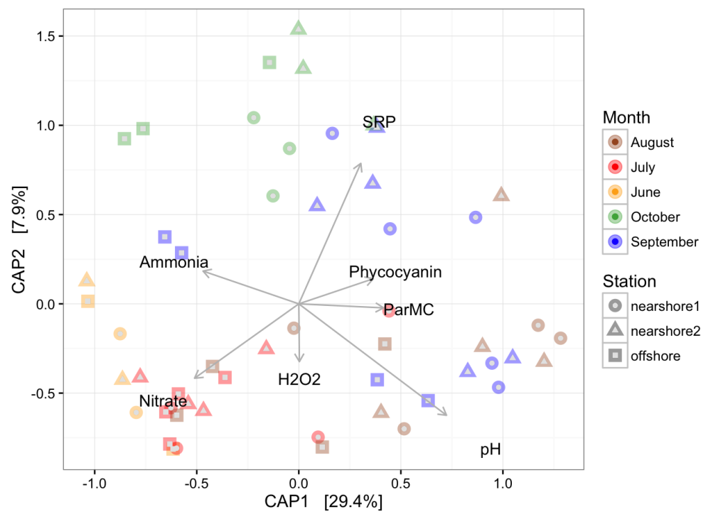
在顺序中使用的约束轴上进行排列方差分析
anova(cap_ord)## Permutation test for capscale under reduced model
## Permutation: free
## Number of permutations: 999
##
## Model: capscale(formula = distance ~ ParMC + Nitrate + SRP + Phycocyanin + Ammonia + pH + H2O2, data = data)
## Df SumOfSqs F Pr(>F)
## Model 7 3.1215 5.6409 0.001 ***
## Residual 45 3.5574
## ---
## Signif. codes: 0 '***' 0.001 '**' 0.01 '*' 0.05 '.' 0.1 ' ' 1阿尔法多样性
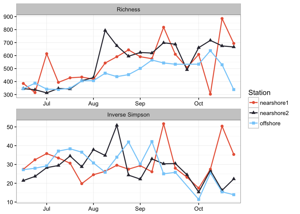
无论你做什么,估计微生物群落的 alpha 多样性都是有问题的。我最好的尝试是对文库进行子采样,以替换来估计真实种群的物种丰度,同时标准化抽样工作。
min_lib <- min(sample_sums(erie))我们将子采样到 1.563110^{4},即最小读取次数。我们将重复此作 100 次,并对每次试验的多样性估计值进行平均。
# Initialize matrices to store richness and evenness estimates
nsamp = nsamples(erie)
trials = 100

richness <- matrix(nrow = nsamp, ncol = trials)
row.names(richness) <- sample_names(erie)

evenness <- matrix(nrow = nsamp, ncol = trials)
row.names(evenness) <- sample_names(erie)

# It is always important to set a seed when you subsample so your result is replicable
set.seed(3)

for (i in 1:100) {
  # Subsample
  r <- rarefy_even_depth(erie, sample.size = min_lib, verbose = FALSE, replace = TRUE)

  # Calculate richness
  rich <- as.numeric(as.matrix(estimate_richness(r, measures = "Observed")))
  richness[ ,i] <- rich

  # Calculate evenness
  even <- as.numeric(as.matrix(estimate_richness(r, measures = "InvSimpson")))
  evenness[ ,i] <- even
}
让我们计算观察到的丰富度和逆辛普森指数的每个样本的平均值和标准差,并将这些值存储在数据帧中。
# Create a new dataframe to hold the means and standard deviations of richness estimates
SampleID <- row.names(richness)
mean <- apply(richness, 1, mean)
sd <- apply(richness, 1, sd)
measure <- rep("Richness", nsamp)
rich_stats <- data.frame(SampleID, mean, sd, measure)

# Create a new dataframe to hold the means and standard deviations of evenness estimates
SampleID <- row.names(evenness)
mean <- apply(evenness, 1, mean)
sd <- apply(evenness, 1, sd)
measure <- rep("Inverse Simpson", nsamp)
even_stats <- data.frame(SampleID, mean, sd, measure)
现在,我们将对丰富度和均匀度的估计值合并到一个数据框中
alpha <- rbind(rich_stats, even_stats)让我们使用 merge() 命令将示例元数据添加到此数据框中
s <- data.frame(sample_data(erie))
alphadiv <- merge(alpha, s, by = "SampleID")
最后,我们将在绘制之前对该数据集中的一些因素进行重新排序
alphadiv <- order_dates(alphadiv)最后,我们将使用一个分面绘制时间序列中的两个 alpha 多样性度量
ggplot(alphadiv, aes(x = Date, y = mean, color = Station, group = Station, shape = Station)) +
  geom_point(size = 2) +
  geom_line(size = 0.8) +
  facet_wrap(~measure, ncol = 1, scales = "free") +
  scale_color_manual(values = c("#E96446", "#302F3D", "#87CEFA")) +
  scale_x_discrete(
    breaks = c("7/8", "8/4", "9/2", "10/6"),
    labels = c("Jul", "Aug", "Sep", "Oct"),
    drop = FALSE
  ) +
  theme(
    axis.title.x = element_blank(),
    axis.title.y = element_blank()
  )
会话信息
sessionInfo()## R version 3.2.2 (2015-08-14)
## Platform: x86_64-apple-darwin13.4.0 (64-bit)
## Running under: OS X 10.9.5 (Mavericks)
##
## locale:
## [1] en_US.UTF-8/en_US.UTF-8/en_US.UTF-8/C/en_US.UTF-8/en_US.UTF-8
##
## attached base packages:
## [1] grid stats graphics grDevices utils datasets methods
## [8] base
##
## other attached packages:
## [1] phyloseq_1.12.2 reshape2_1.4.1 scales_0.4.0 dplyr_0.4.3
## [5] vegan_2.3-1 lattice_0.20-33 permute_0.8-4 ggplot2_2.1.0
##
## loaded via a namespace (and not attached):
## [1] Biobase_2.28.0 splines_3.2.2
## [3] foreach_1.4.3 Formula_1.2-1
## [5] assertthat_0.1 stats4_3.2.2
## [7] latticeExtra_0.6-26 yaml_2.1.13
## [9] RSQLite_1.0.0 chron_2.3-47
## [11] digest_0.6.9 GenomicRanges_1.20.8
## [13] RColorBrewer_1.1-2 XVector_0.8.0
## [15] colorspace_1.2-6 htmltools_0.2.6
## [17] Matrix_1.2-2 plyr_1.8.3
## [19] DESeq2_1.8.2 XML_3.98-1.3
## [21] genefilter_1.50.0 zlibbioc_1.14.0
## [23] xtable_1.7-4 BiocParallel_1.2.22
## [25] annotate_1.46.1 mgcv_1.8-7
## [27] IRanges_2.2.9 lazyeval_0.1.10
## [29] nnet_7.3-11 BiocGenerics_0.14.0
## [31] proto_0.3-10 survival_2.38-3
## [33] RJSONIO_1.3-0 magrittr_1.5
## [35] evaluate_0.8 nlme_3.1-122
## [37] MASS_7.3-44 RcppArmadillo_0.6.100.0.0
## [39] foreign_0.8-66 tools_3.2.2
## [41] data.table_1.9.6 formatR_1.2.1
## [43] stringr_1.0.0 S4Vectors_0.6.6
## [45] locfit_1.5-9.1 munsell_0.4.3
## [47] cluster_2.0.3 AnnotationDbi_1.30.1
## [49] lambda.r_1.1.7 Biostrings_2.36.4
## [51] ade4_1.7-2 GenomeInfoDb_1.4.3
## [53] futile.logger_1.4.1 iterators_1.0.8
## [55] biom_0.3.12 igraph_1.0.1
## [57] labeling_0.3 rmarkdown_0.9.5
## [59] multtest_2.24.0 gtable_0.2.0
## [61] codetools_0.2-14 DBI_0.3.1
## [63] R6_2.1.1 gridExtra_2.0.0
## [65] knitr_1.11 Hmisc_3.17-0
## [67] futile.options_1.0.0 ape_3.3
## [69] stringi_1.0-1 parallel_3.2.2
## [71] Rcpp_0.12.3 geneplotter_1.46.0
## [73] rpart_4.1-10 acepack_1.3-3.3